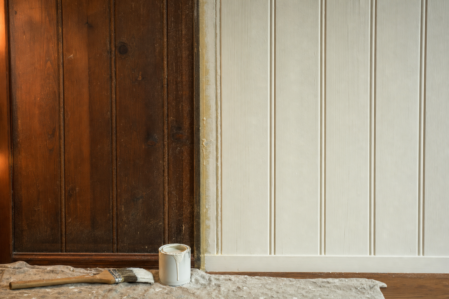
You picked the color at the store. It looked warm, soft, exactly right against the little cardboard swatch. Then it went up on the wall, and now it looks like something else entirely — colder, darker, or just off in a way you can't quite name.
This happens to almost everyone, and it's not a sign you have bad taste or that we mixed the paint wrong. A paint chip is tiny, viewed under store lighting, next to nothing but other paint chips. Your wall is enormous by comparison, lit by whatever light actually comes through your windows at whatever time of day you're looking at it, sitting next to your floors, your trim, your furniture — all of which change how your eye reads that color. Colorists call part of this metamerism: the same exact pigment can look like two different colors depending on the light source and what's around it. It's not an illusion you're imagining. It's how human color vision actually works.
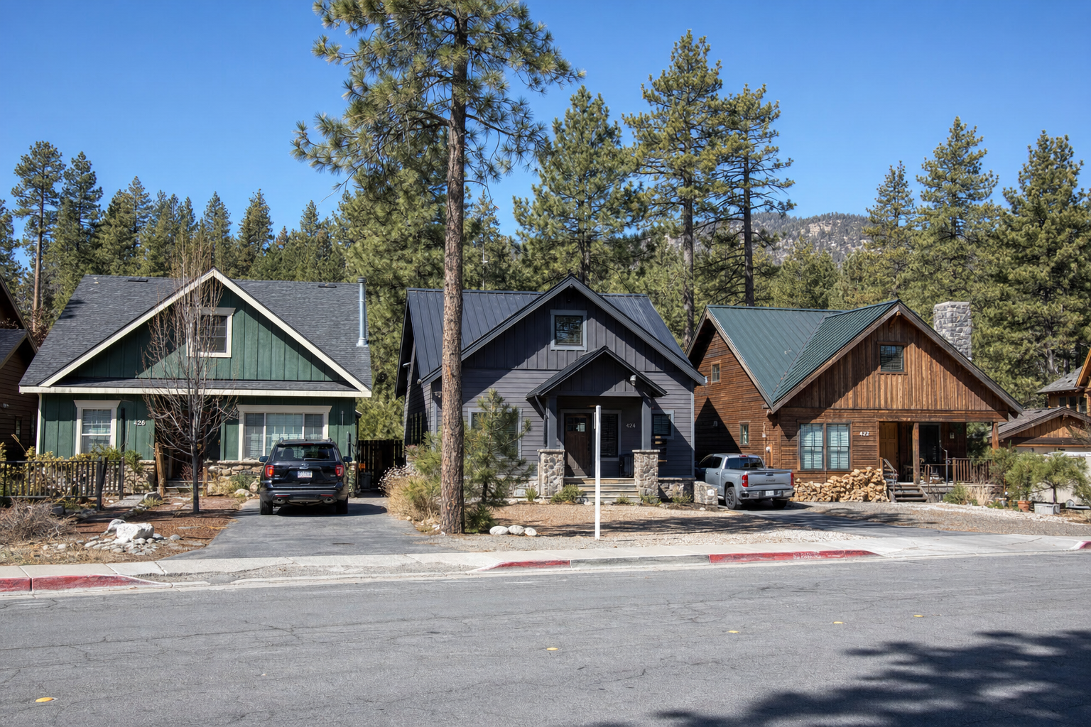
Big Bear adds its own layer on top of all that. The intense, high-elevation sunlight here is measurably stronger than what you'd get at sea level — the same effect we've written about in terms of
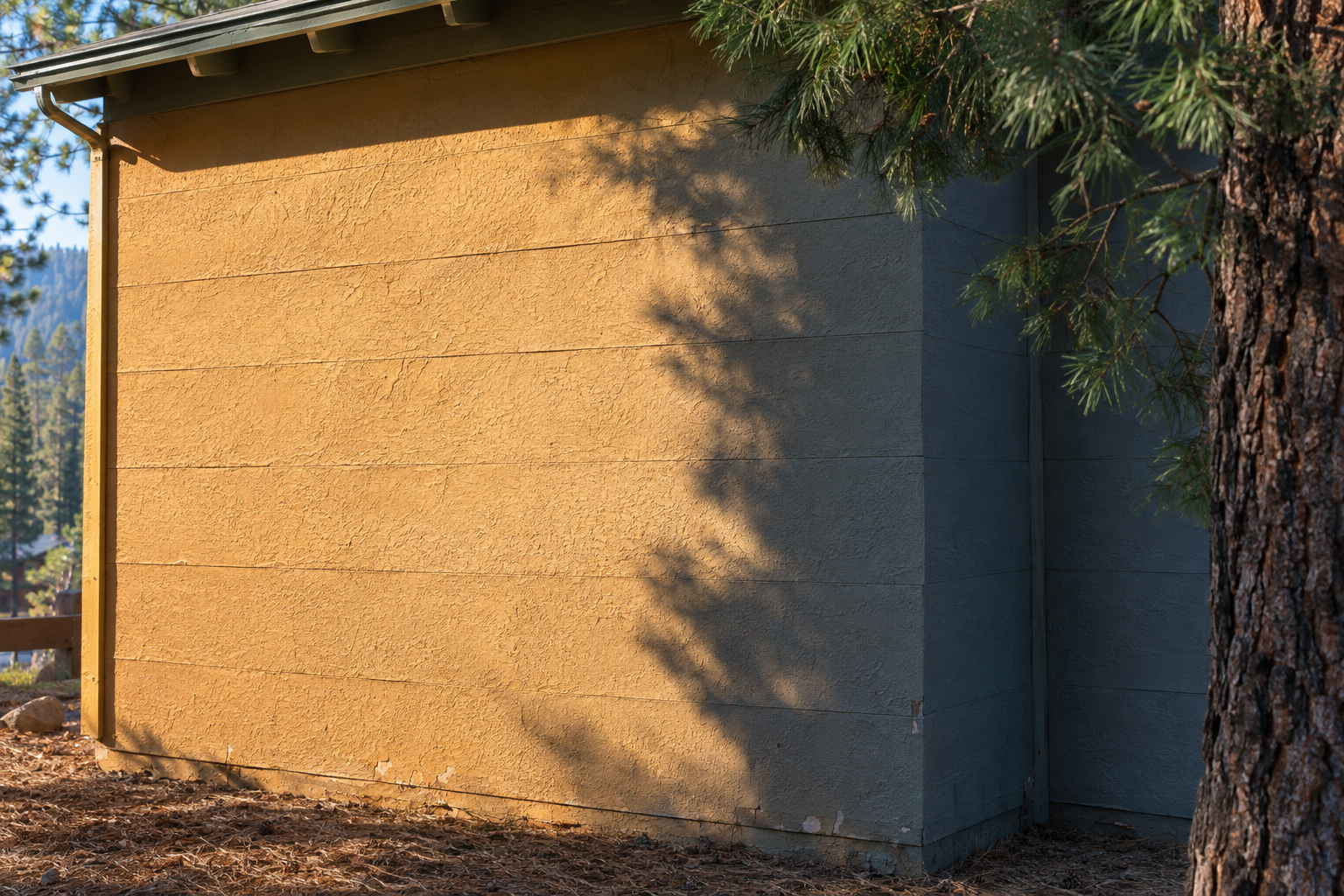
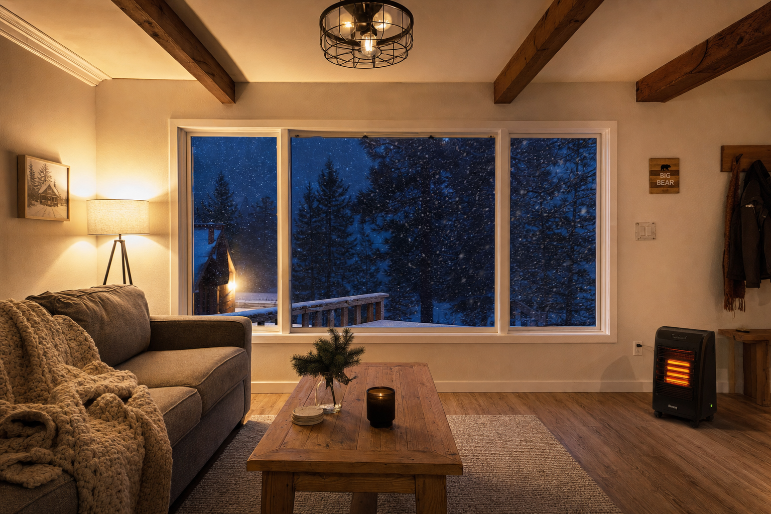
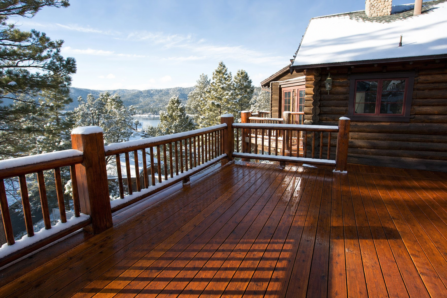
how it fades exterior paint faster — which also means colors simply read differently in direct sun here than they would in a store showroom or a flatland home. A soft gray that looked perfectly neutral on the chip can pick up a noticeably cooler, almost blue cast under Big Bear's sharper midday light. Meanwhile, walls or rooms that sit in the shade of the pine trees surrounding most properties here see the opposite effect — light that's dimmer and cooler in tone, which can make the exact same color look muted or flat compared to how it reads on a sun-facing wall twenty feet away on the same house.
North-facing rooms and walls tend to pull cooler no matter where you live, and that effect is often more pronounced here simply because the contrast between full mountain sun and deep tree shade is so much sharper than what most paint chips are ever tested under.
Sheen changes what you see just as much as light does
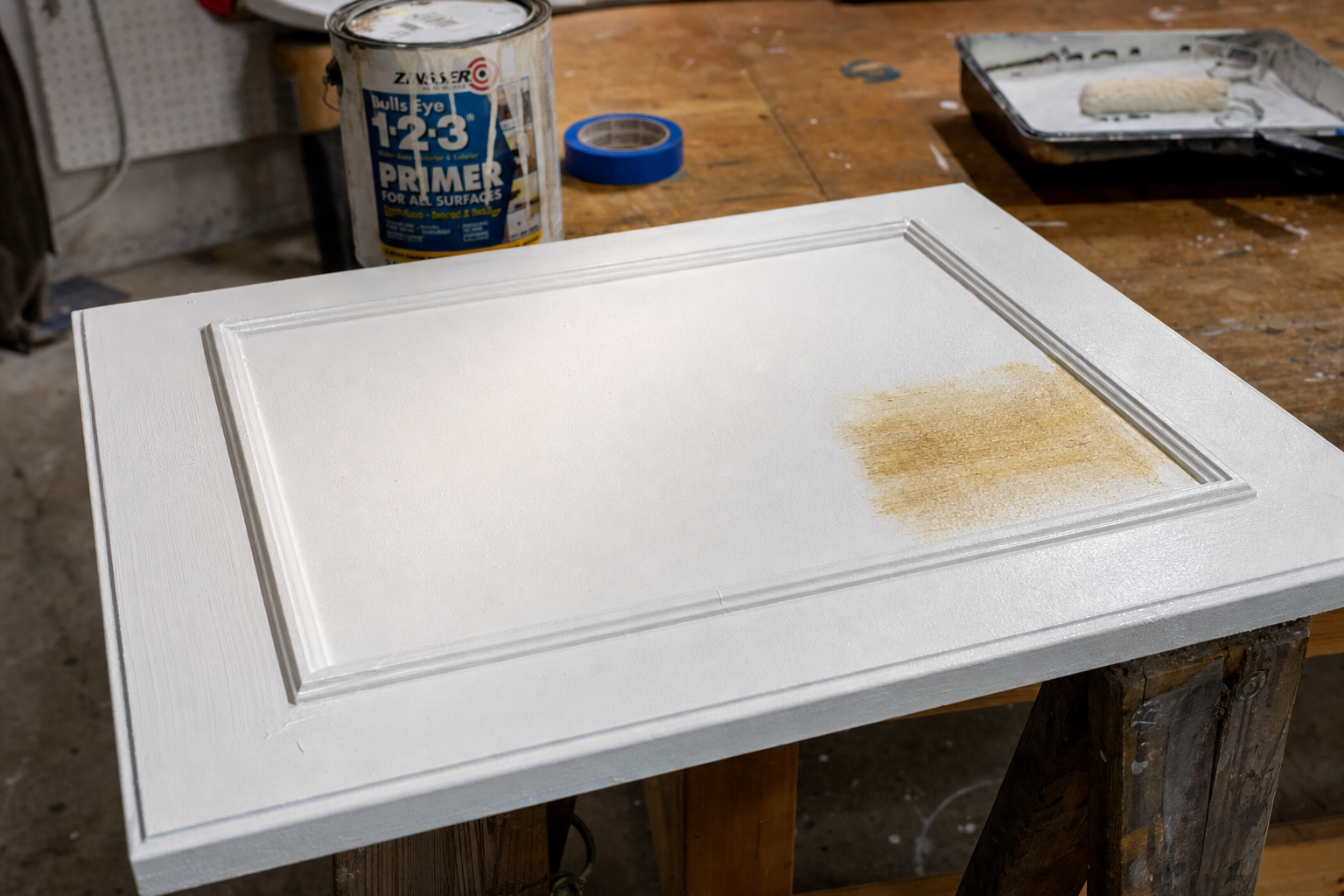
This is a factor separate from lighting entirely, and it's easy to overlook. Flat paint absorbs light rather than reflecting it, which tends to make a color read slightly lighter and softer than the same shade in a glossier finish. Semi-gloss and satin reflect more light back at the viewer, which generally makes the same underlying color look a shade darker and more saturated. If you're comparing a flat swatch in the store to a semi-gloss trim sample at home, you're not just dealing with different lighting — you're looking at genuinely different visual results from the identical can of paint, before light or shade ever enters the picture.
Undertones hide until you isolate them
Every paint color, including whites and grays that look perfectly neutral on a small chip, is built from a mix of underlying pigments — and those underlying tones stay invisible at swatch size but surface once you're looking at an entire wall. A white that reads clean and bright next to a rack of other paint chips can suddenly show a yellow or green cast once it's the only color in the room. The simplest way to catch this before you commit: hold the swatch against a plain sheet of white printer paper rather than against other colors. Undertones that were completely hidden a moment ago tend to become obvious almost instantly once there's nothing else competing for your eye's attention.
What actually helps before you commit to gallons
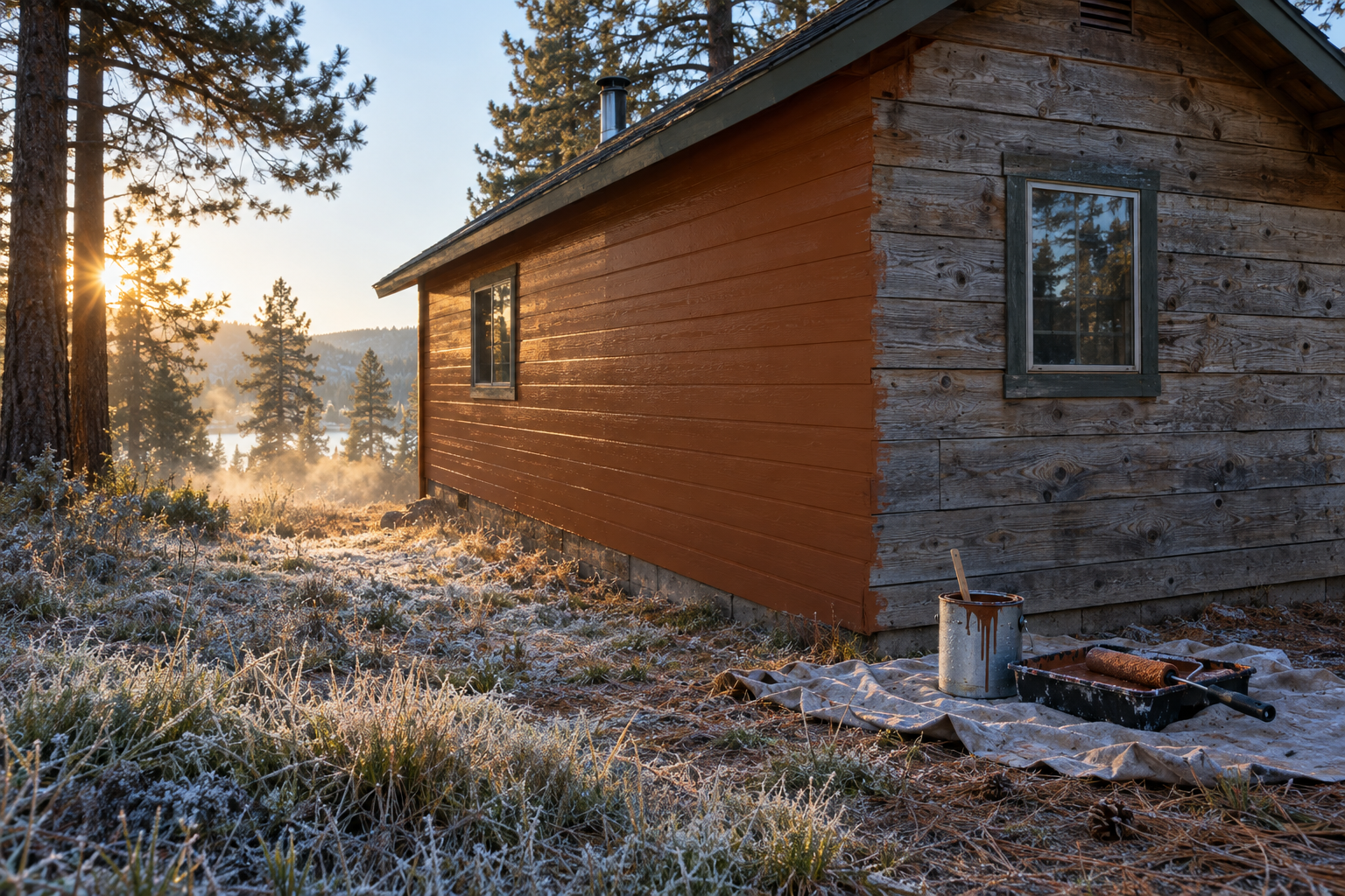
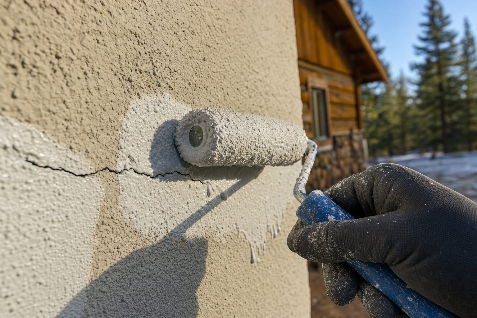
Paint a large sample — not a tiny chip, an actual poster-sized swatch — directly on the wall or siding itself, and look at it at different times of day. A color that looks right at 10am in full sun can look completely different by 4pm once the shadows from the trees have shifted. Test more than one wall if the room gets mixed light, since a color that works on a south-facing wall may not hold up the same way on the north-facing one three feet away. This is also worth doing before finalizing anything with your
HOA's approved color palette if your property requires one, since a color that reads as compliant on a chip can look meaningfully different once it's covering an entire elevation.
None of this means the color you picked was wrong. It usually means the room, the light, or the exposure told a different story than the four-inch square of paper did.
A few things worth knowing before you buy
How many sample swatches should I actually test?
More than one, and ideally on more than one wall. A single sample tells you how a color looks in one specific spot at one time of day — testing two or three locations with different light exposure gives a much more honest picture before you commit to full gallons.
Does the paint sheen I choose really change how a color looks?
Yes, independent of lighting entirely. Flatter finishes read lighter and softer; glossier finishes reflect more light and read darker and more saturated, even from the exact same can of paint.
Should I test color in the exact room where I'll use it, or is a similar room close enough?
The exact room. Light exposure, surrounding furniture, and even nearby trees or shade patterns are specific enough to that one space that a "similar" room down the hall can give you a genuinely misleading preview.
Get a color consultation that accounts for your specific walls, light, and exposure before you commit to gallons.
Call Big Bear Painters at (909) 415-5374.